Where it all started-
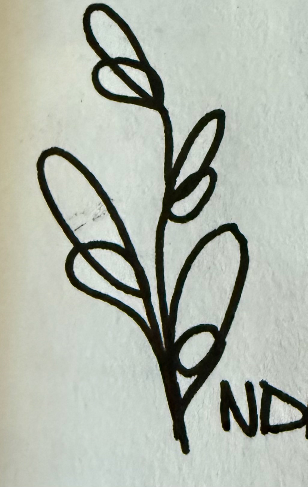
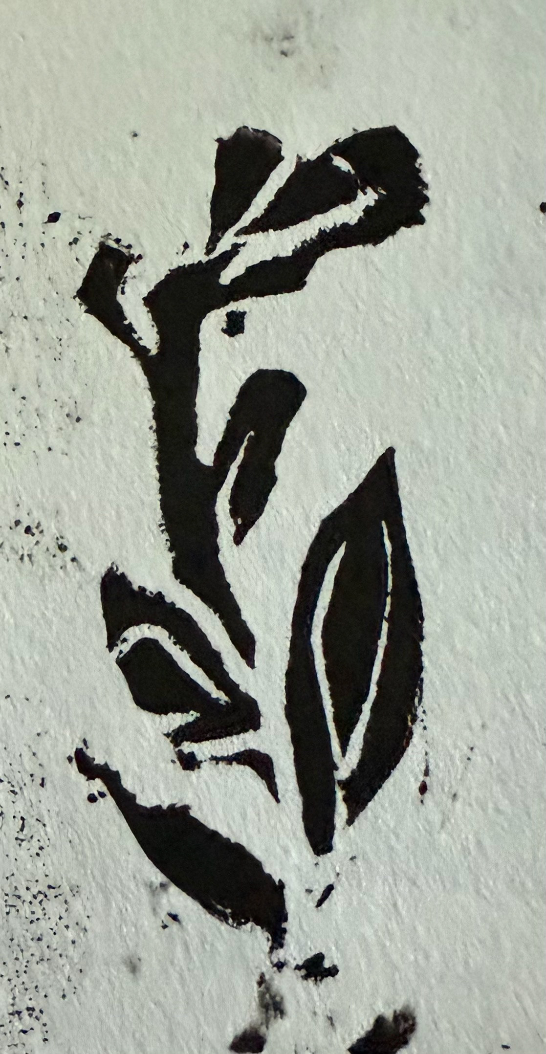
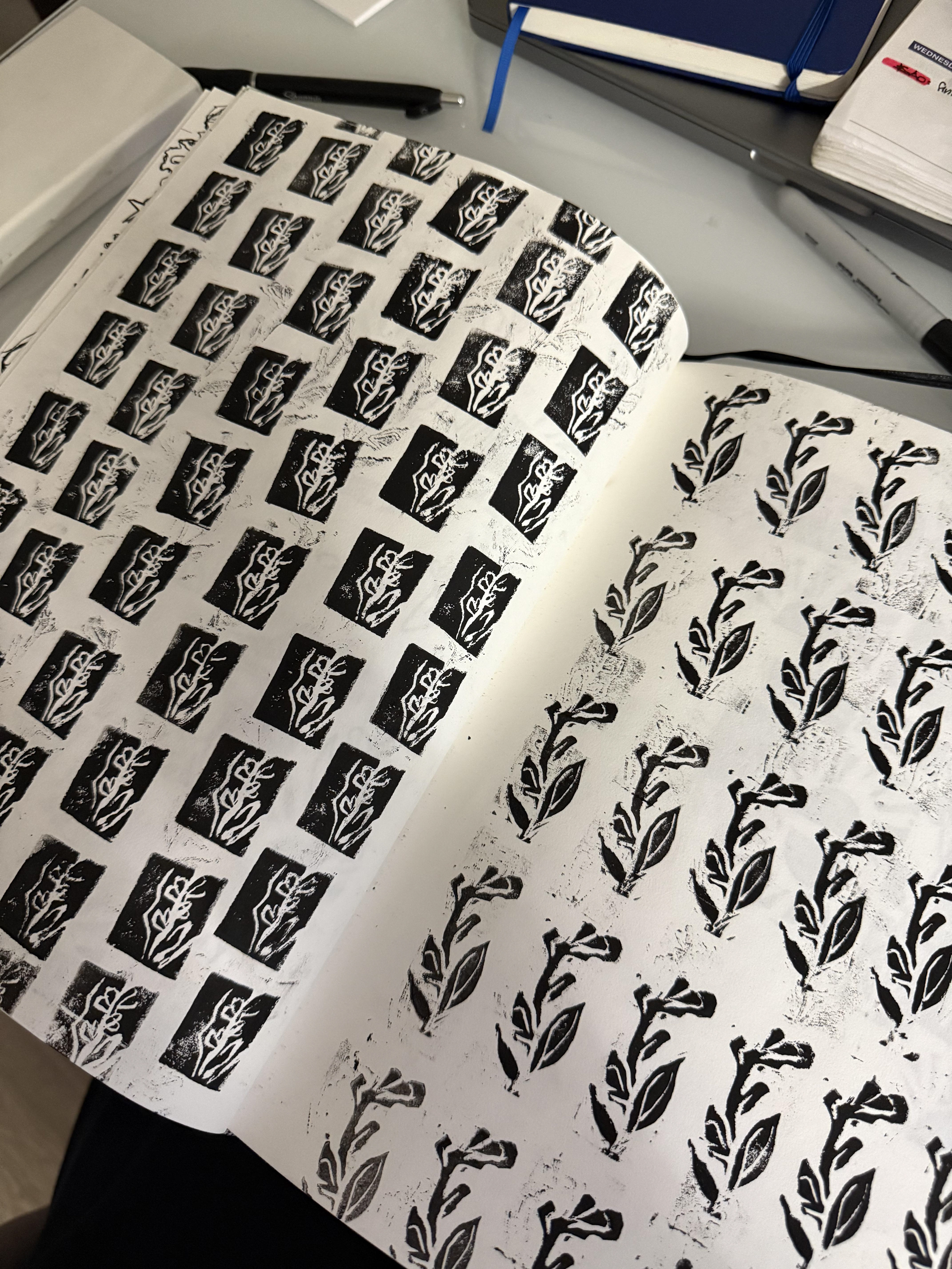
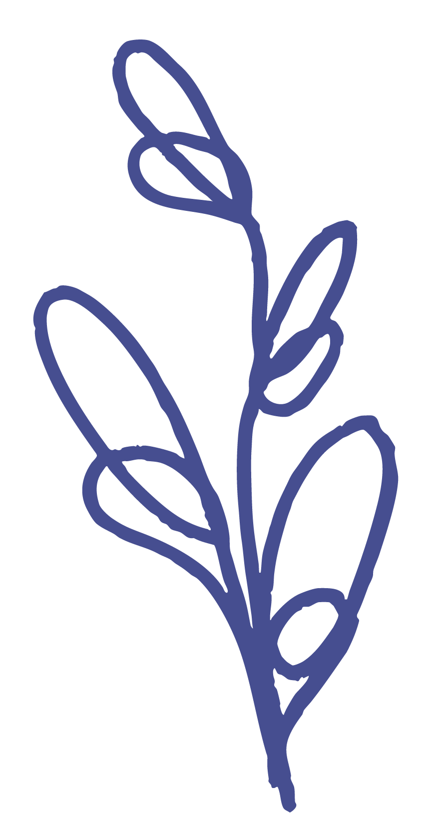
Before moving into digital design, I always begin by exploring ideas through physical making. For Indigo, this hands-on process brought the logo and branding assets to life. I drew on my love for stamp making and contour line drawings, combining both techniques to create visuals that felt tactile, authentic, and deeply personal.
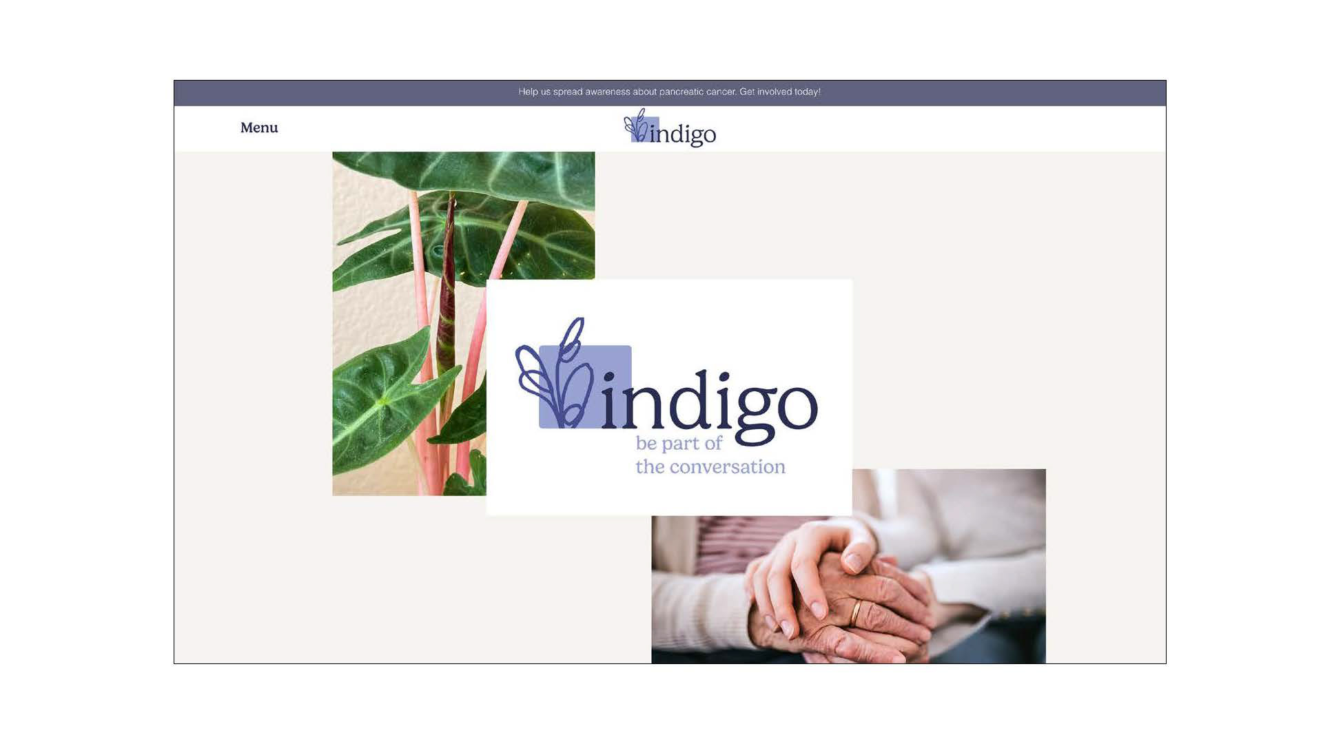
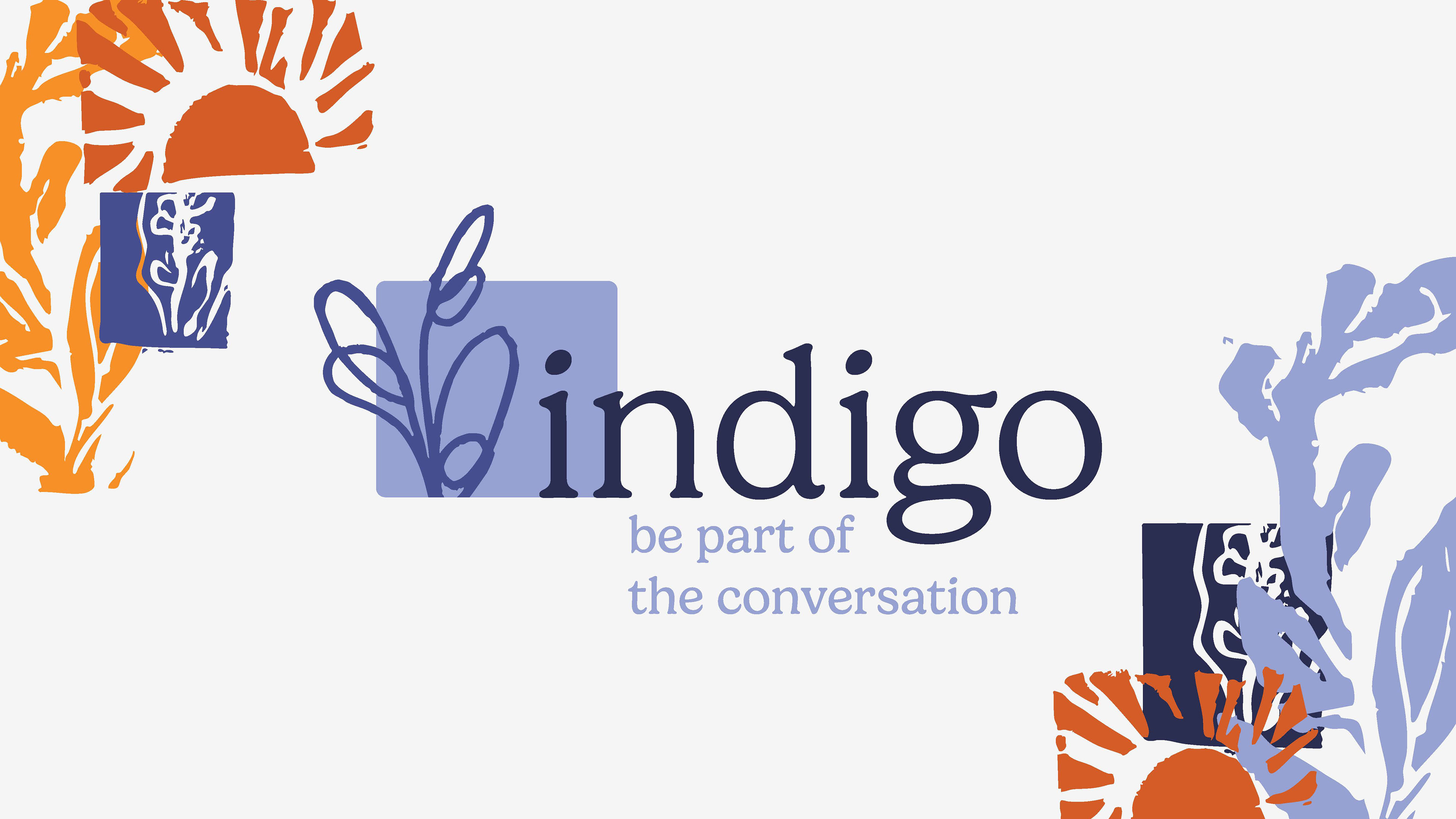
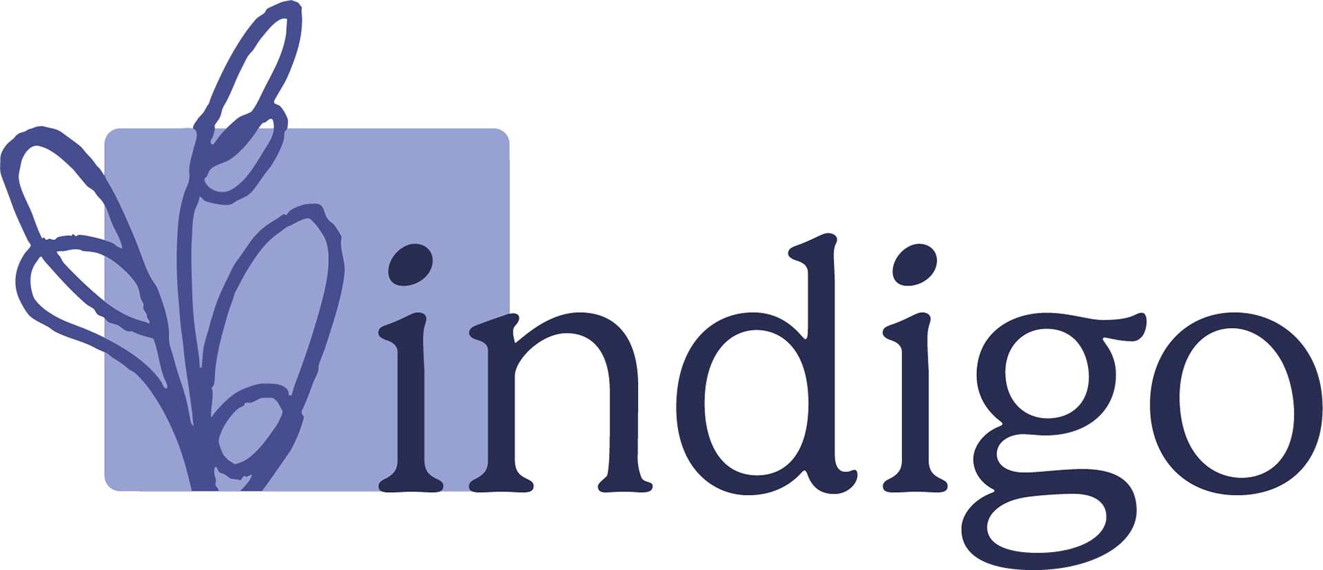
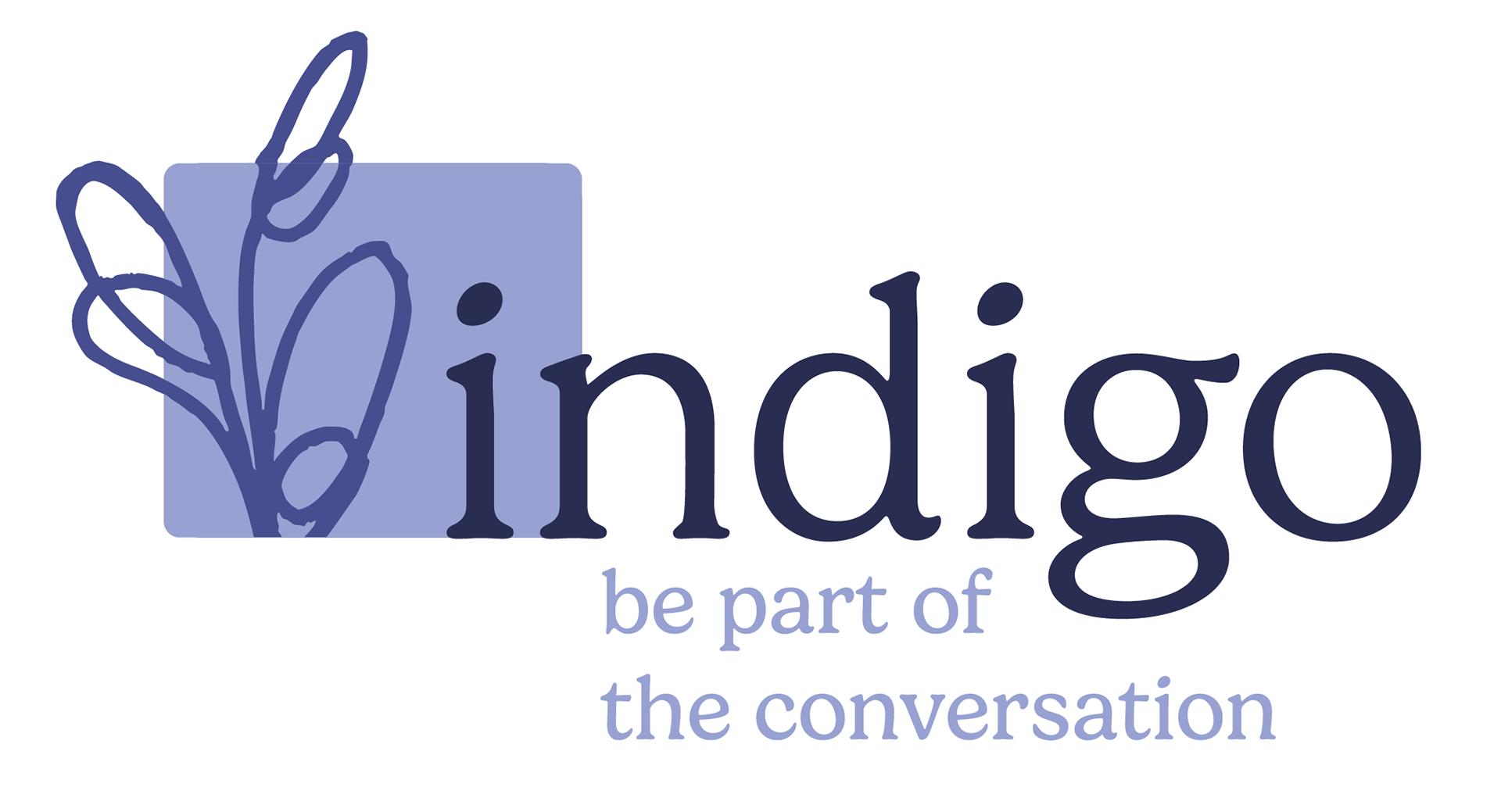
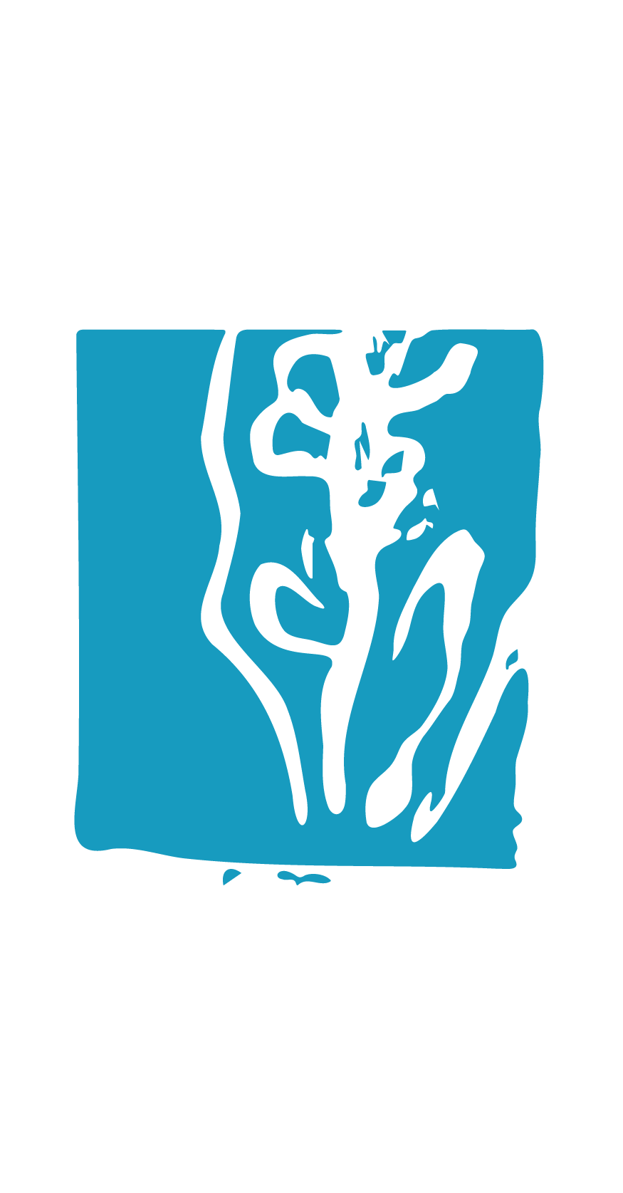
The logo and brand identity
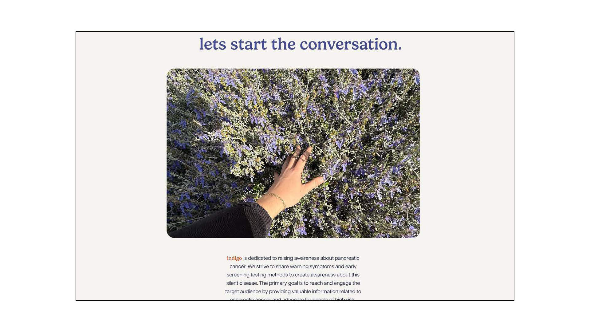
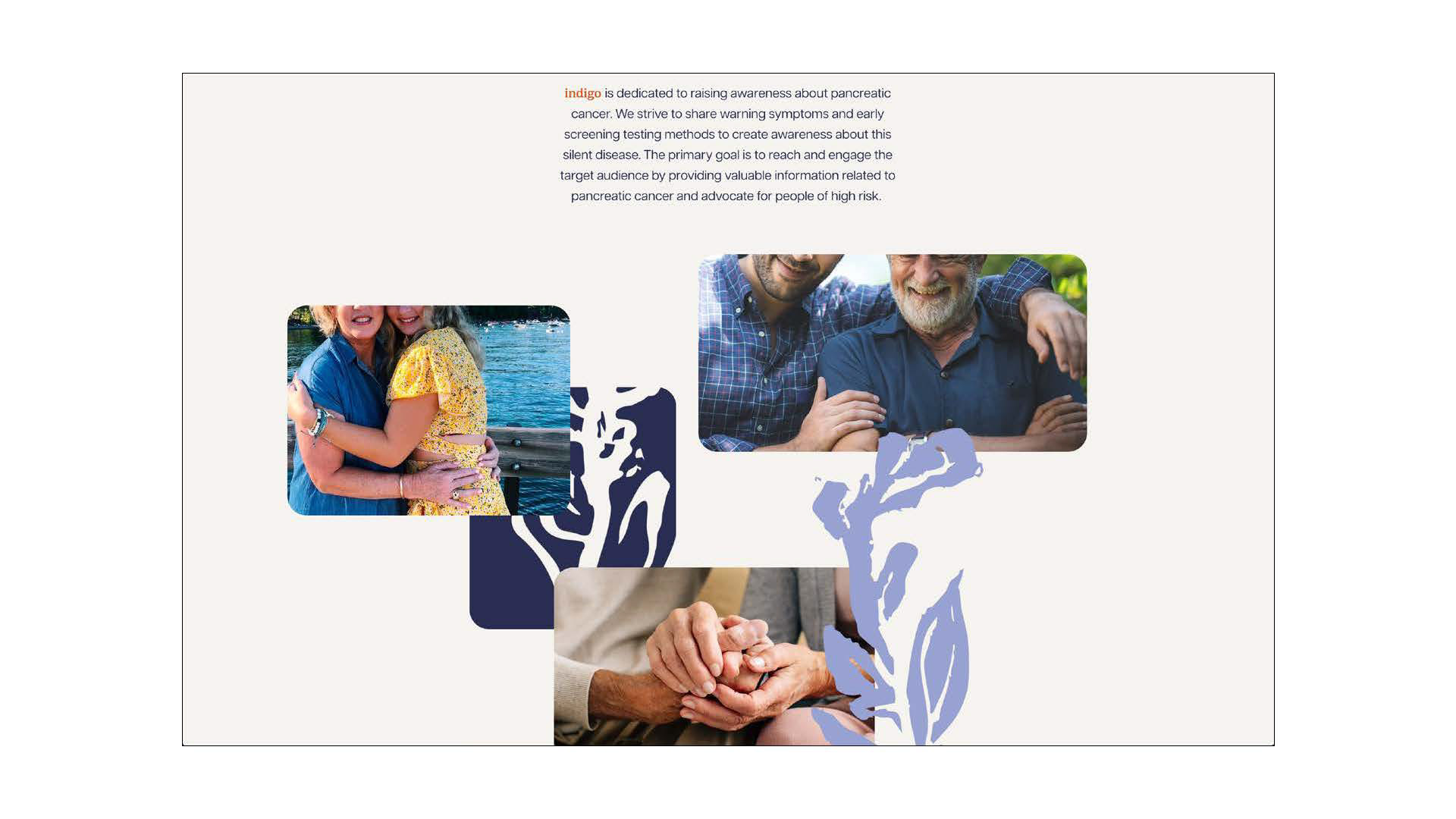
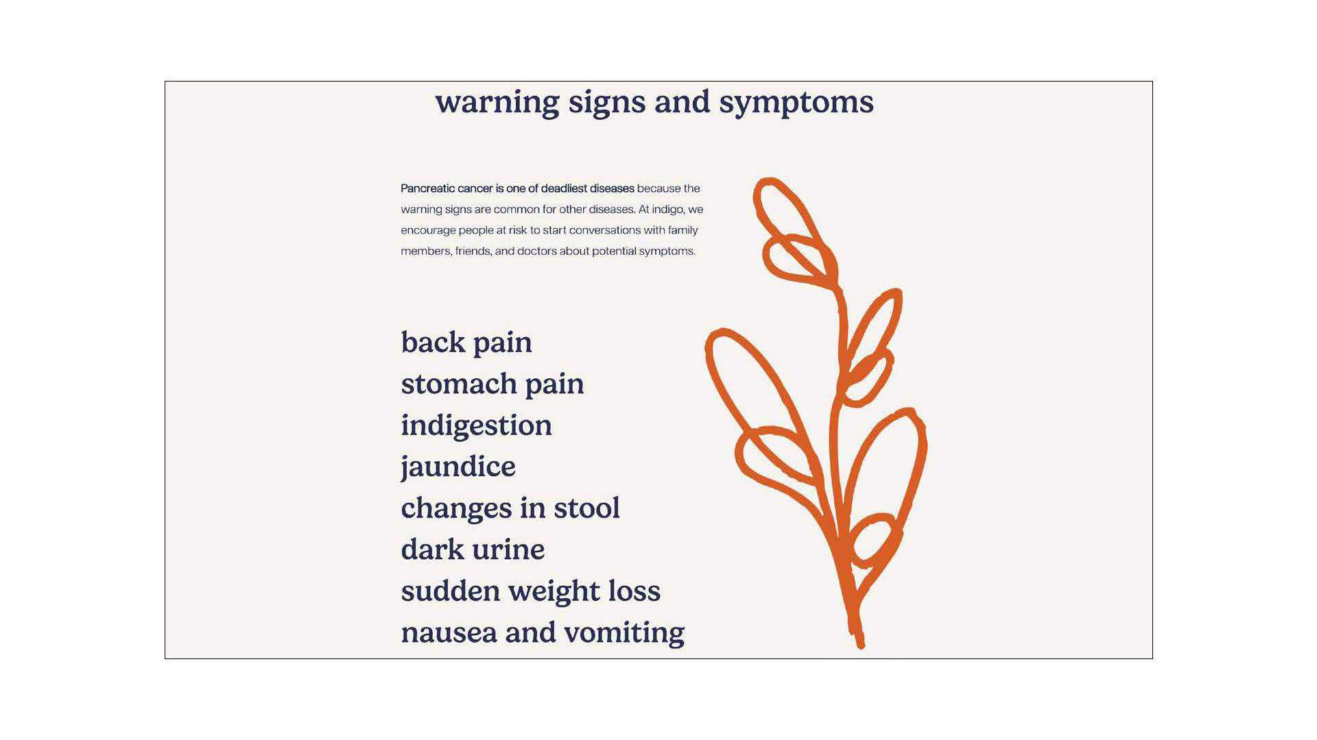
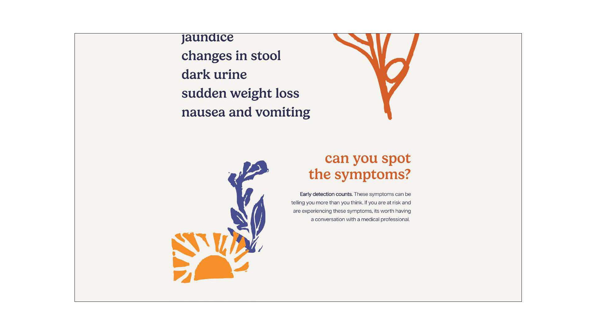
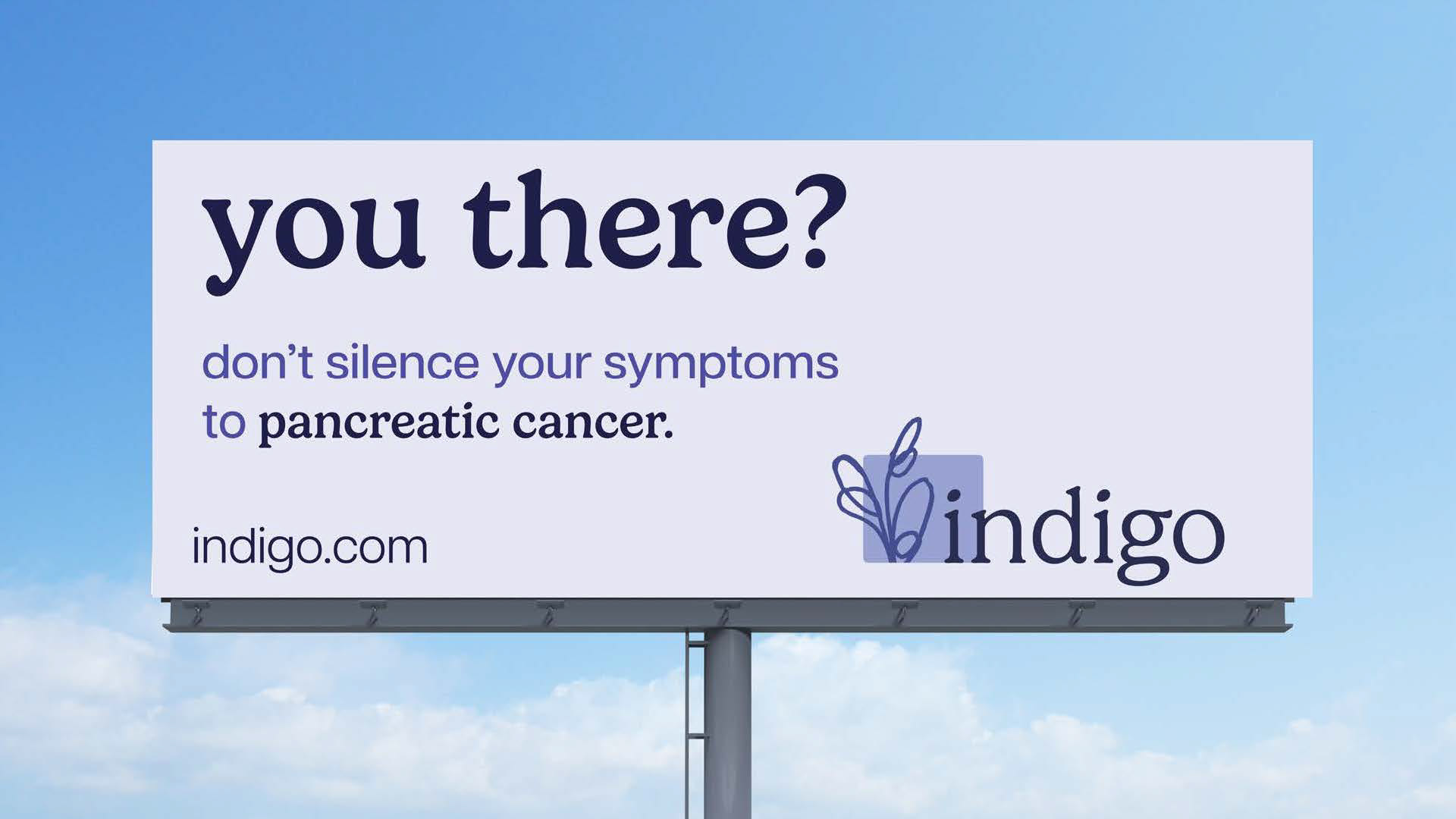
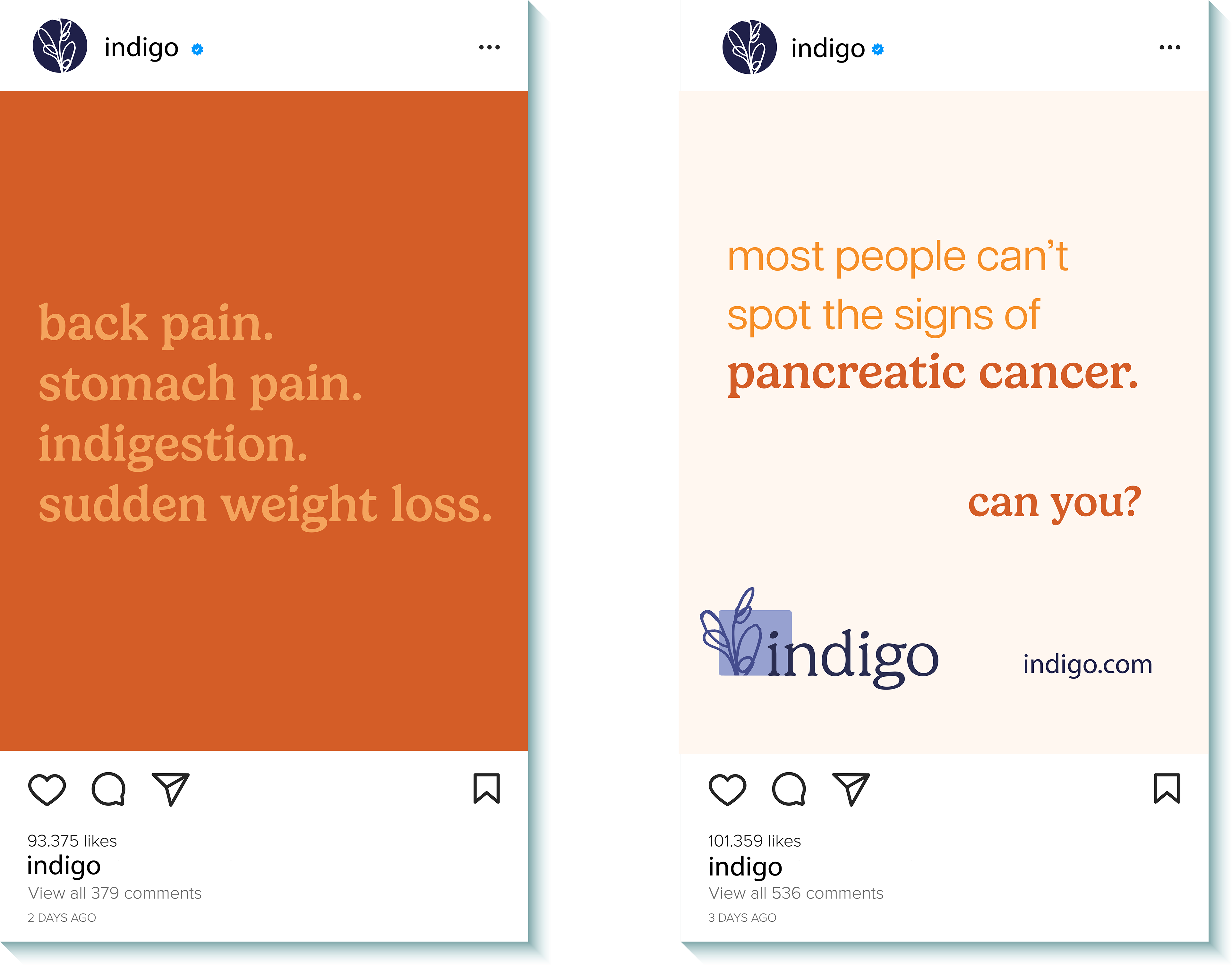
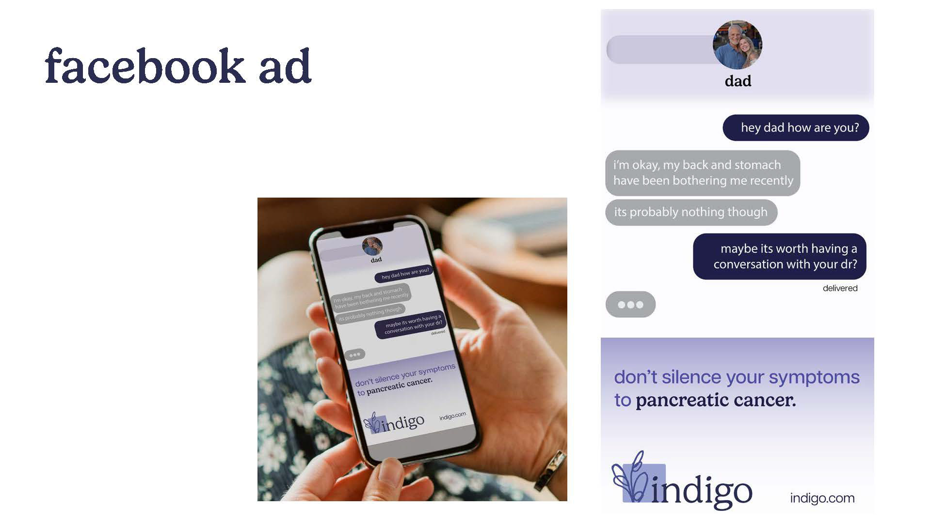
Pancreatic cancer is a difficult and heavy topic. My mission with Indigo was to make the subject more approachable, giving families and those affected a way to begin conversations around this disease. The name came from the awareness color purple—I wanted to honor that connection while shifting it into a tone I connected with more, so I chose indigo. The softness of the contour drawings paired with a humanist typeface created a visual language that feels both approachable and compassionate.


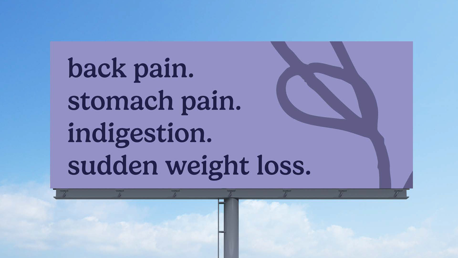
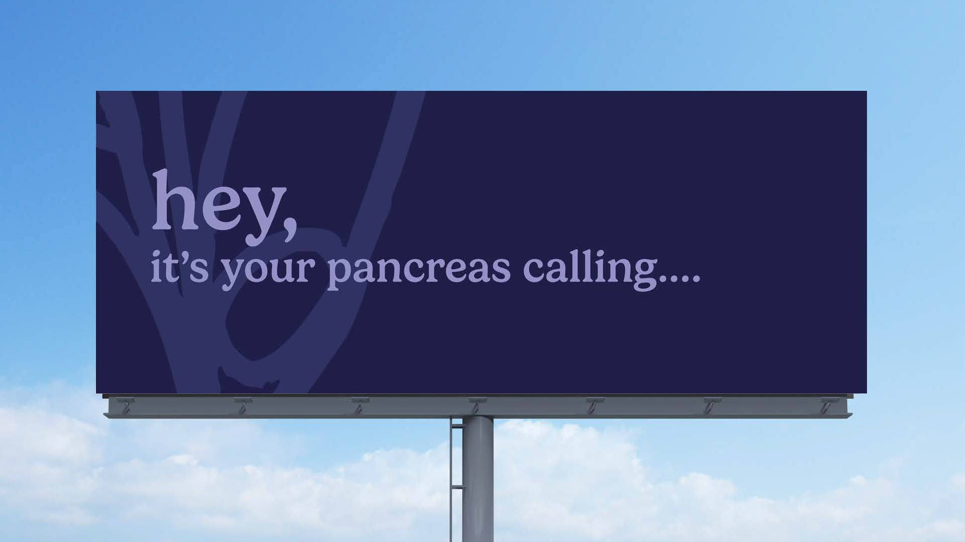
Ad campaigns- Social media and billboard mockups
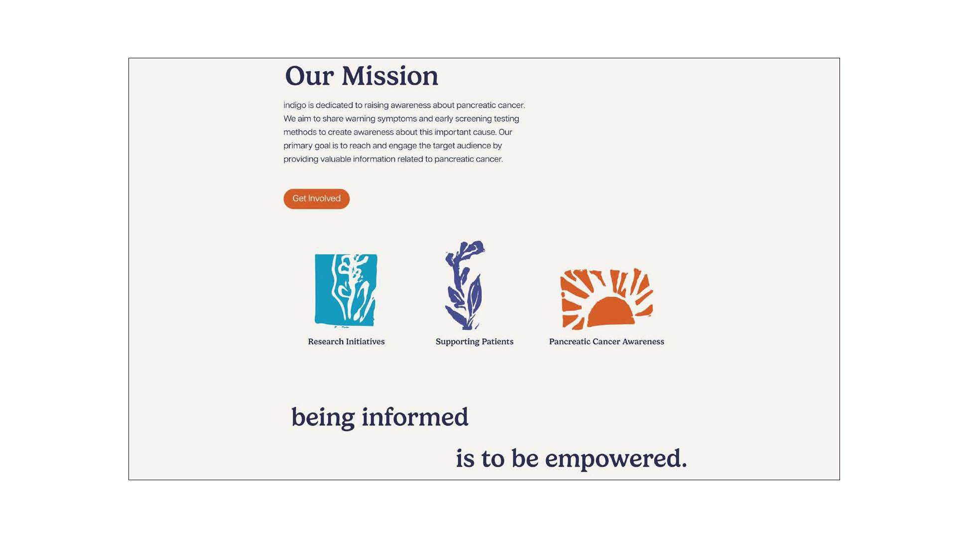
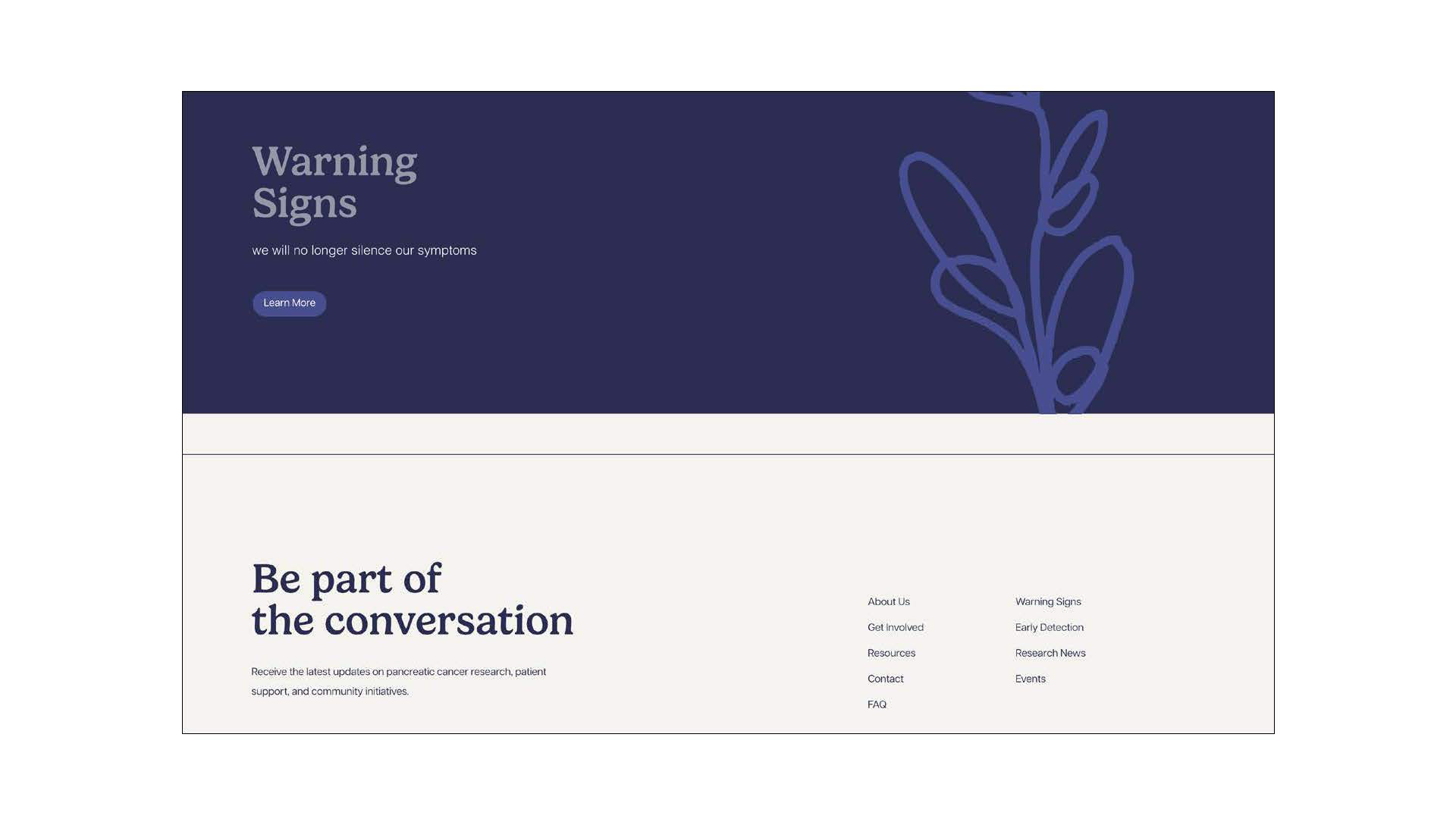
Informational website mockup-
My design approach carried seamlessly into the brand identity and website, resulting in a platform that feels approachable while providing clear, accessible information for families and individuals affected by pancreatic cancer.