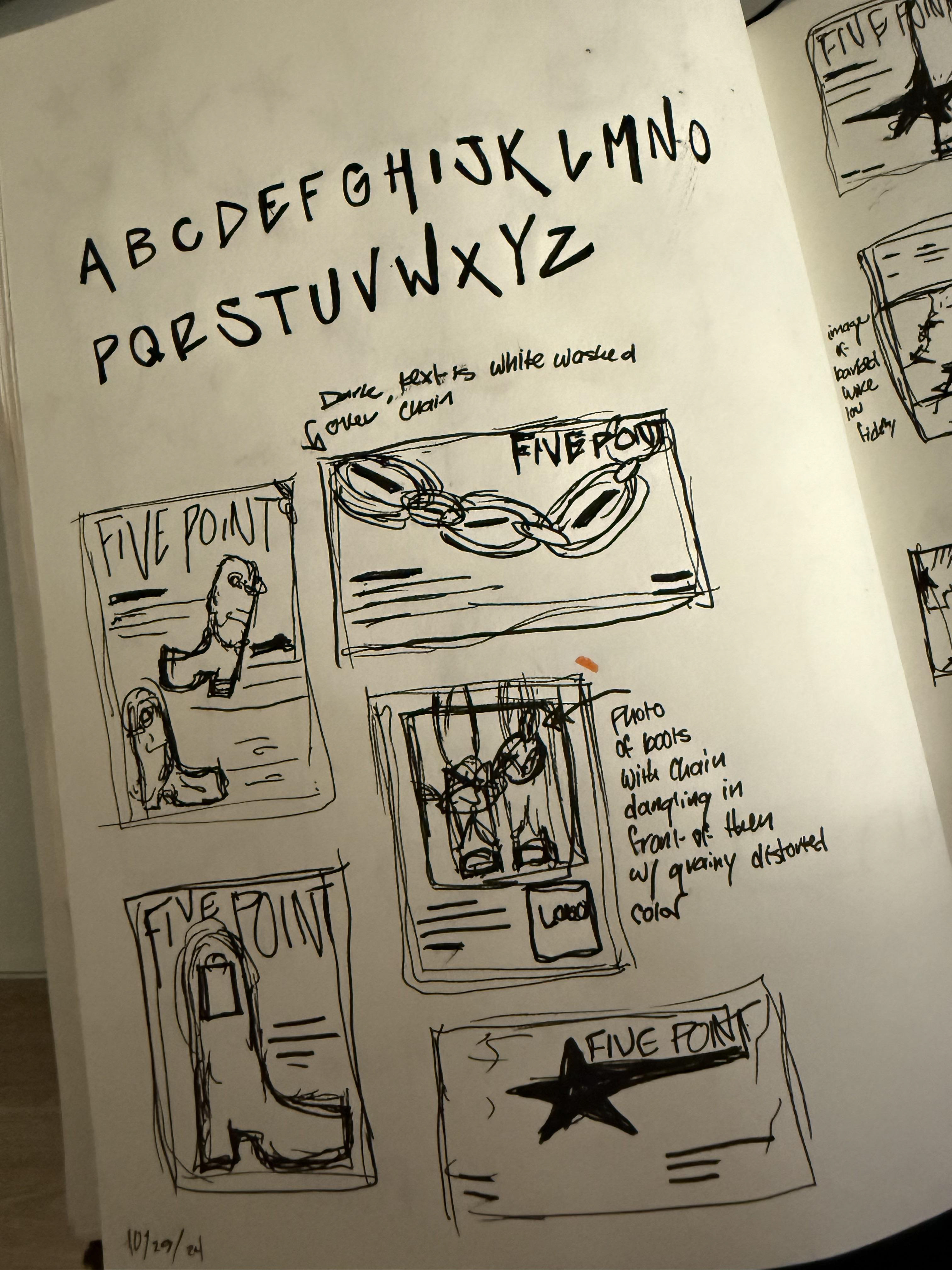
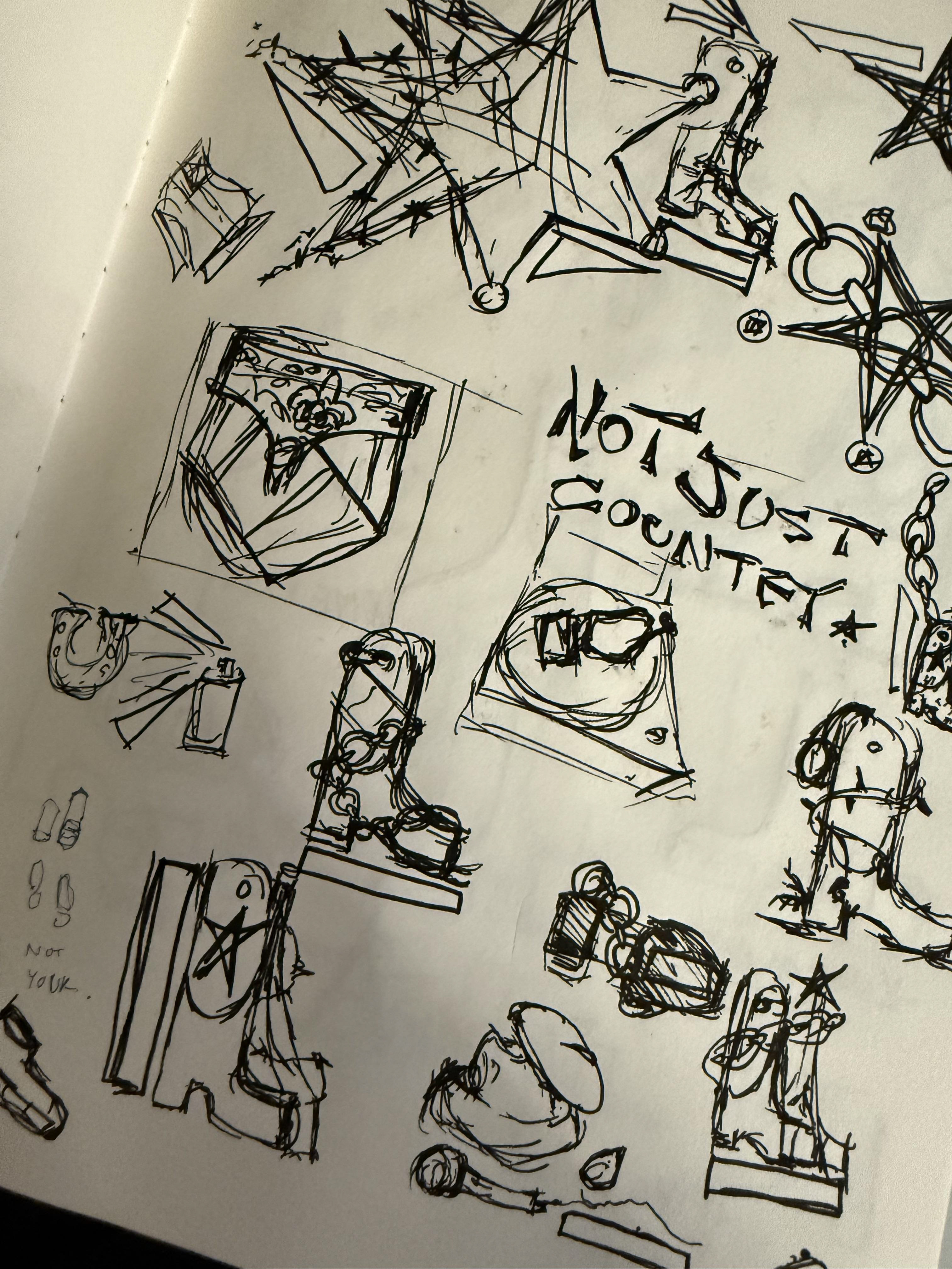
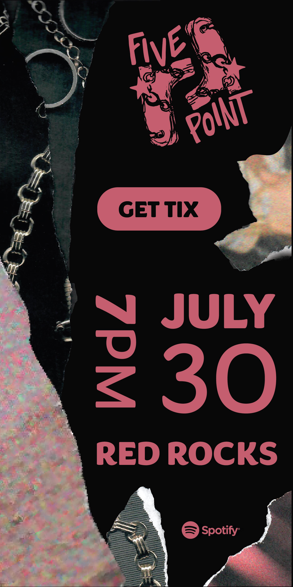
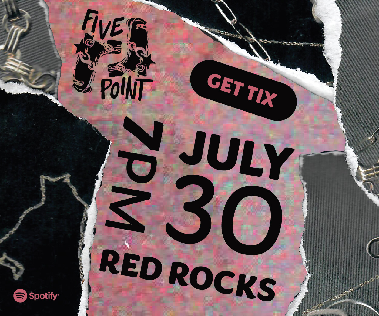
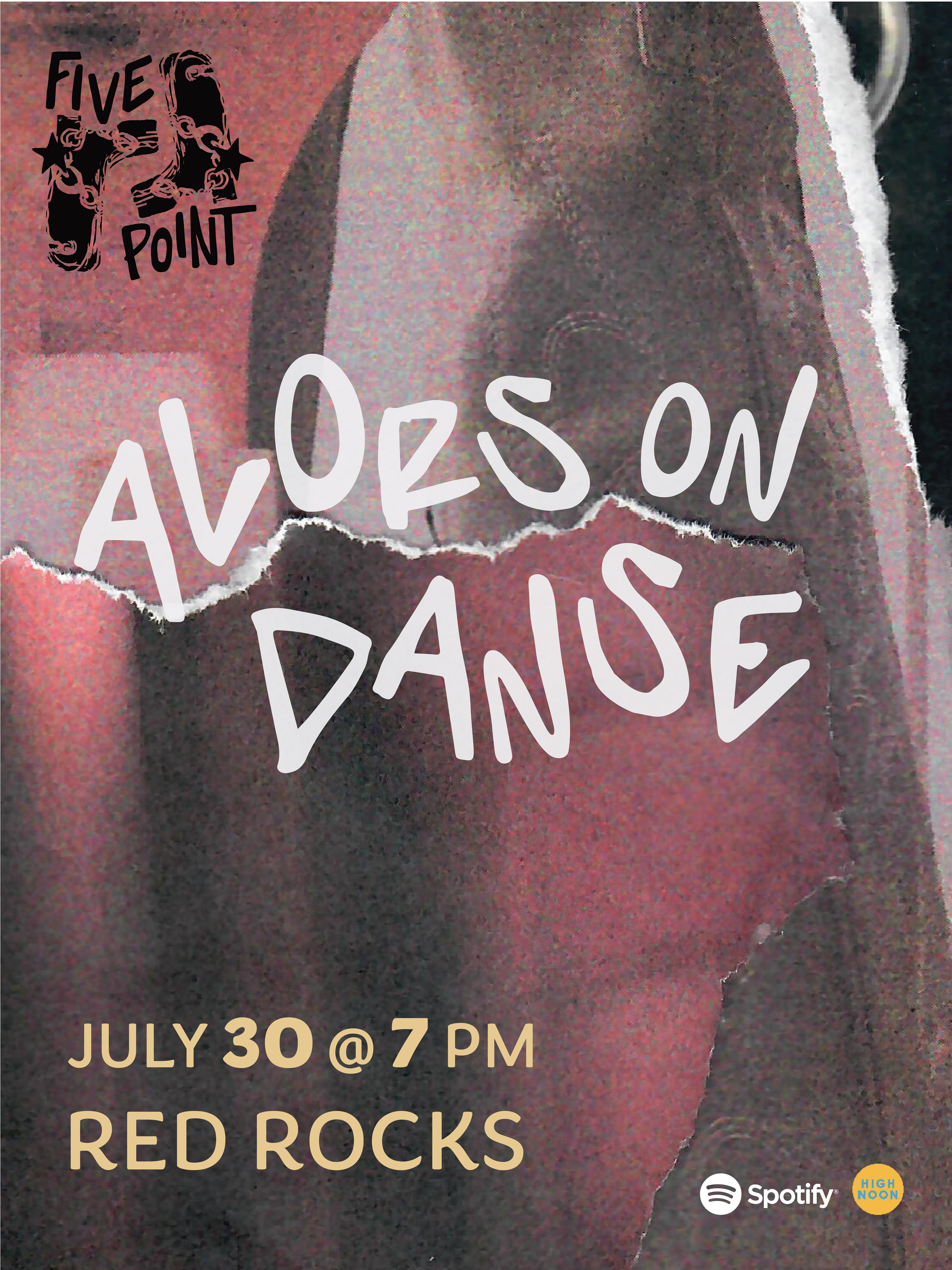
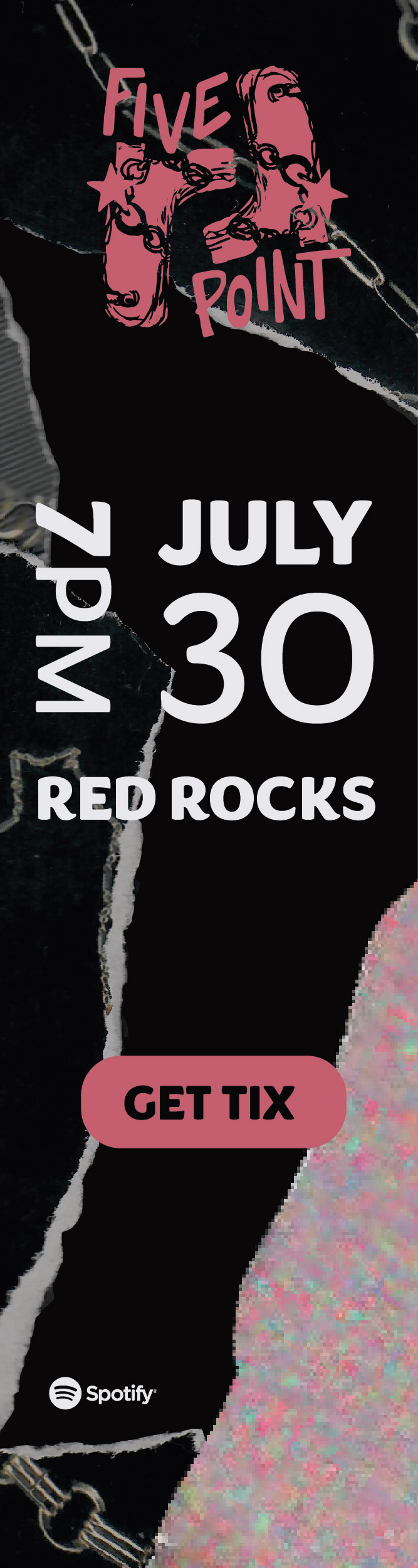
THE LOGO! A hand curated approach-
To bridge the gap between country and French rap, I searched for shared symbols across both cultures. I found a connection in the five points of the Eiffel Tower and the five points of a boot spur or star—this became the inspiration for the festival’s name, Five Point. I hand-drew the logo’s elements and typography, then refined the design by vectorizing and polishing the illustrations in Adobe Illustrator.
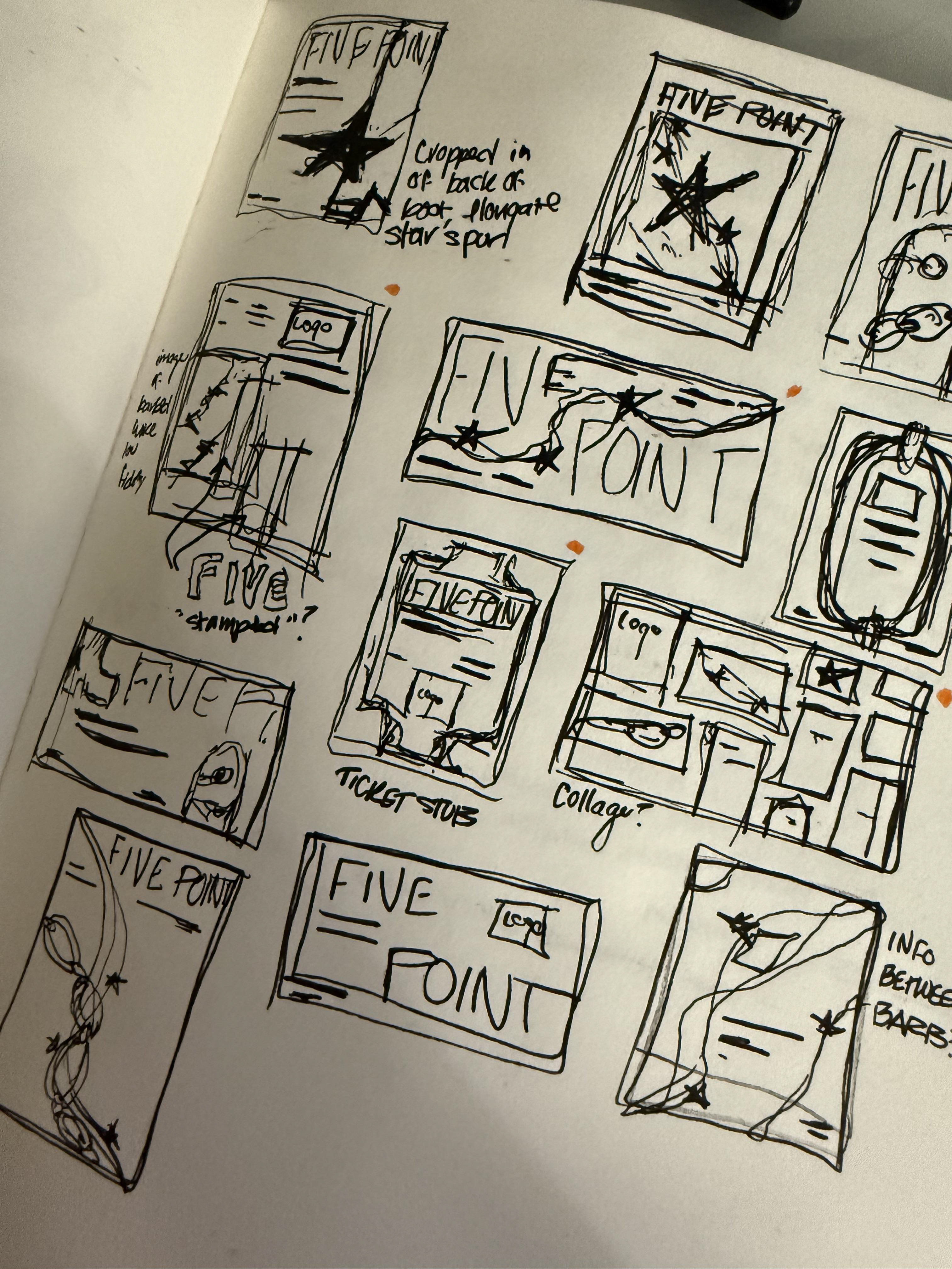
Where it all started-
Before diving into the computer, I always love to explore the physical, its rapid, messy, and FUN!
Digital Ads and Poster Design
The goal was to create vibrant, attention-grabbing ads that appealed to the target audience of 20–40 year olds. Each piece combined bold, flashy graphics with handcrafted imagery for a unique, energetic feel. I experimented with scanning gold chains and layering ripped photographs I had taken, resulting in edgy, original compositions that gave the campaign a raw yet playful character.
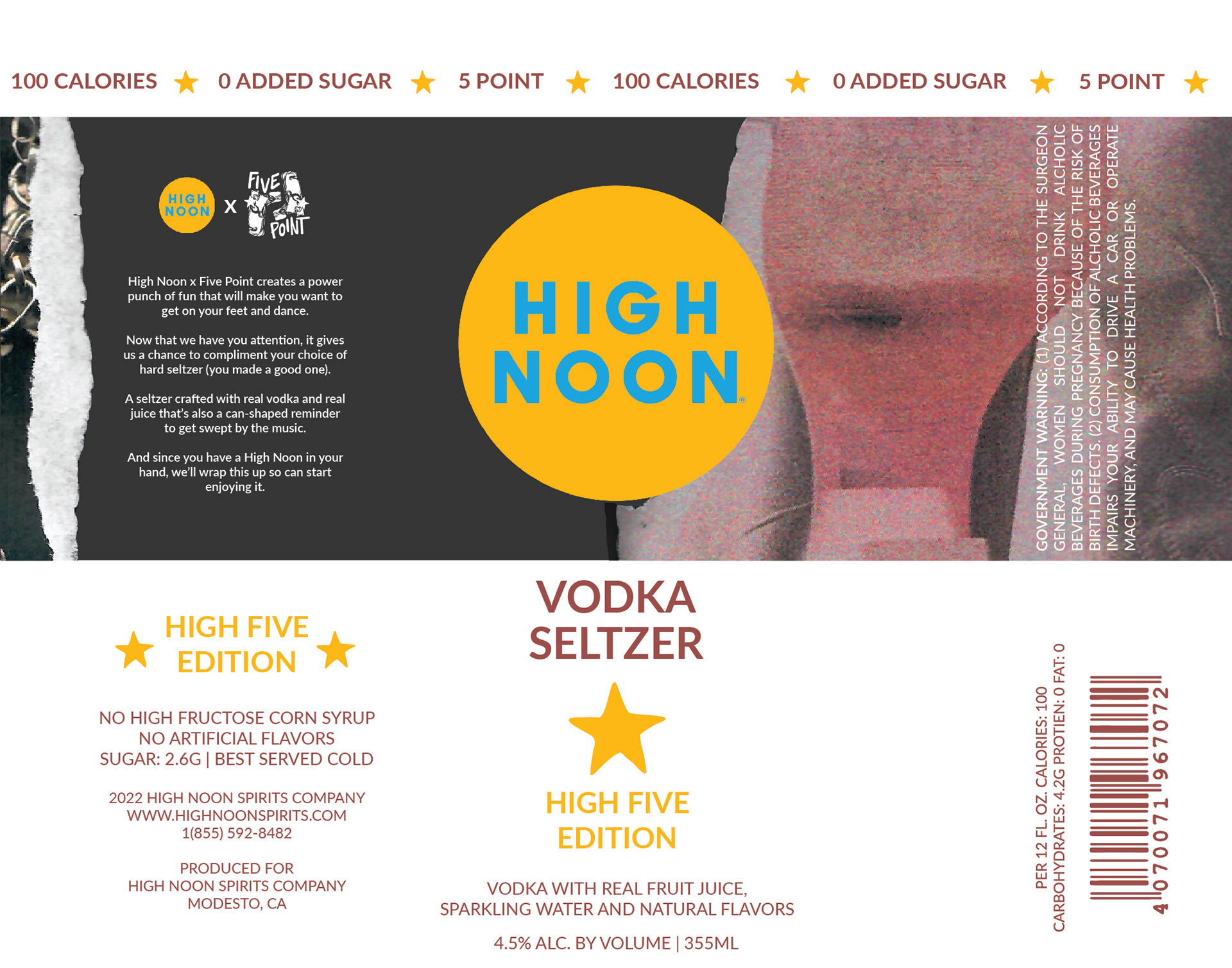
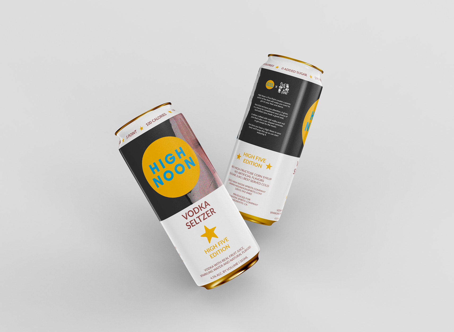
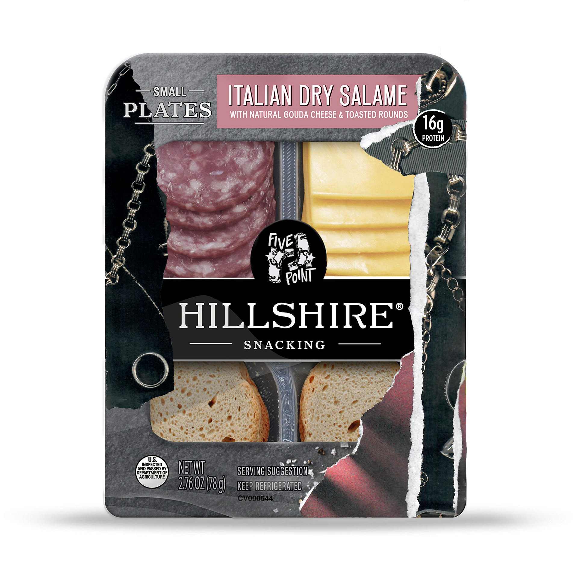
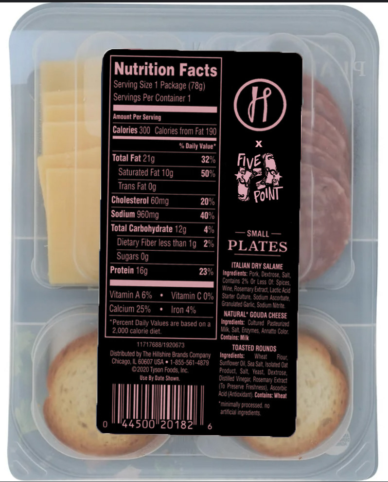
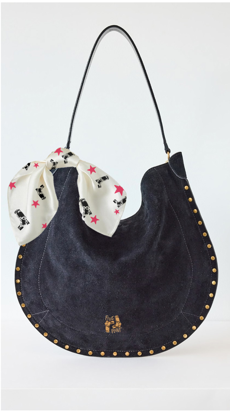
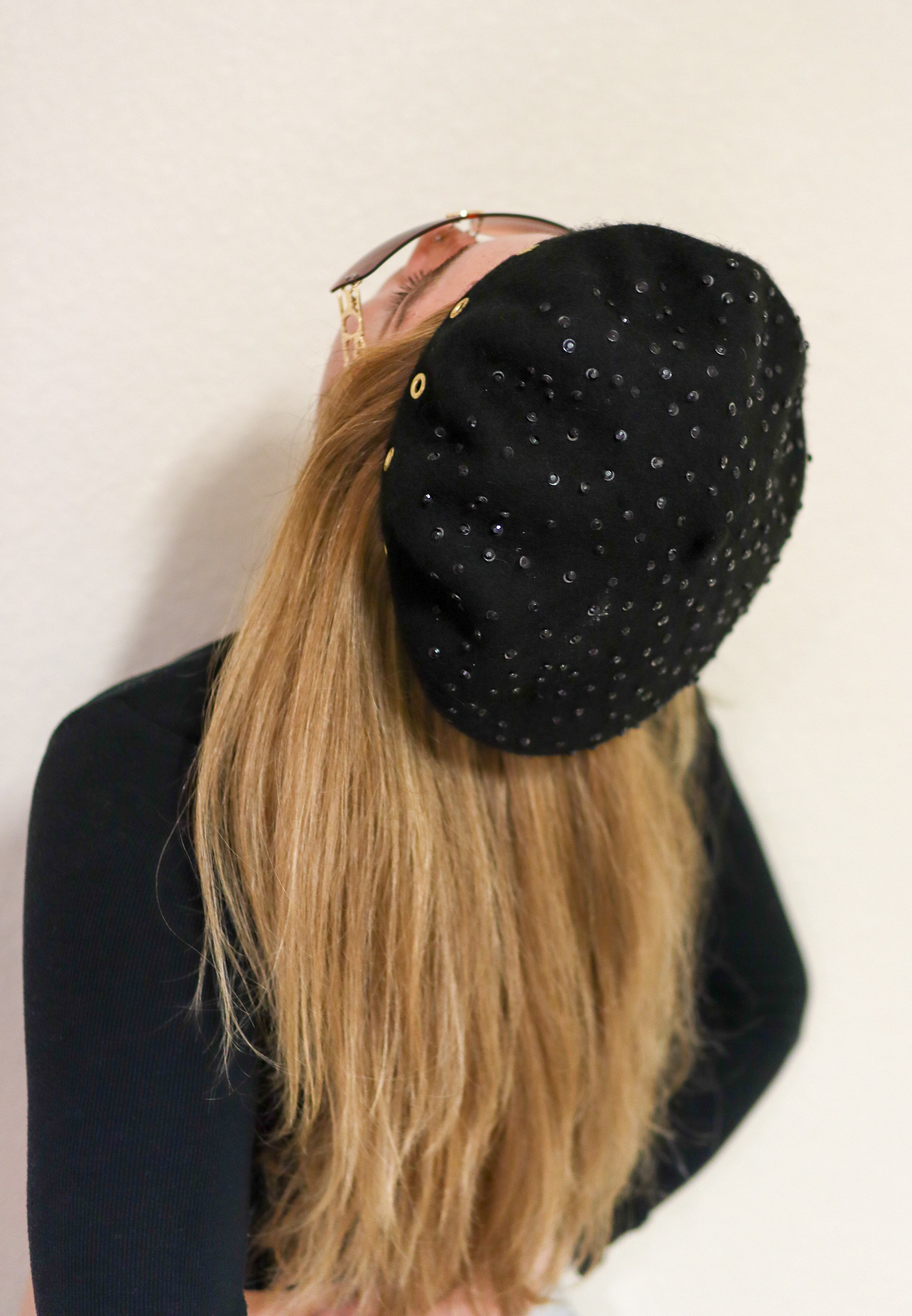
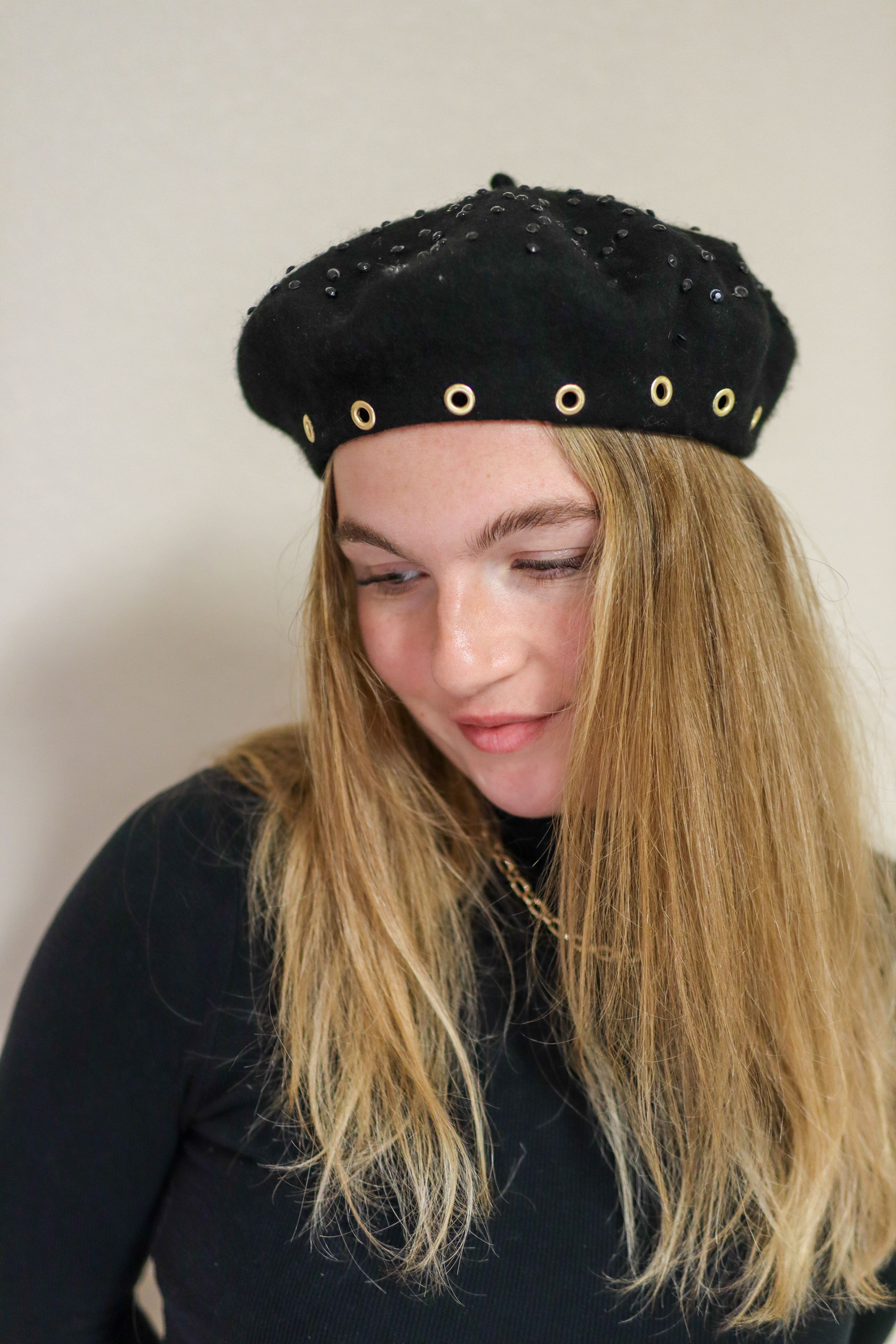
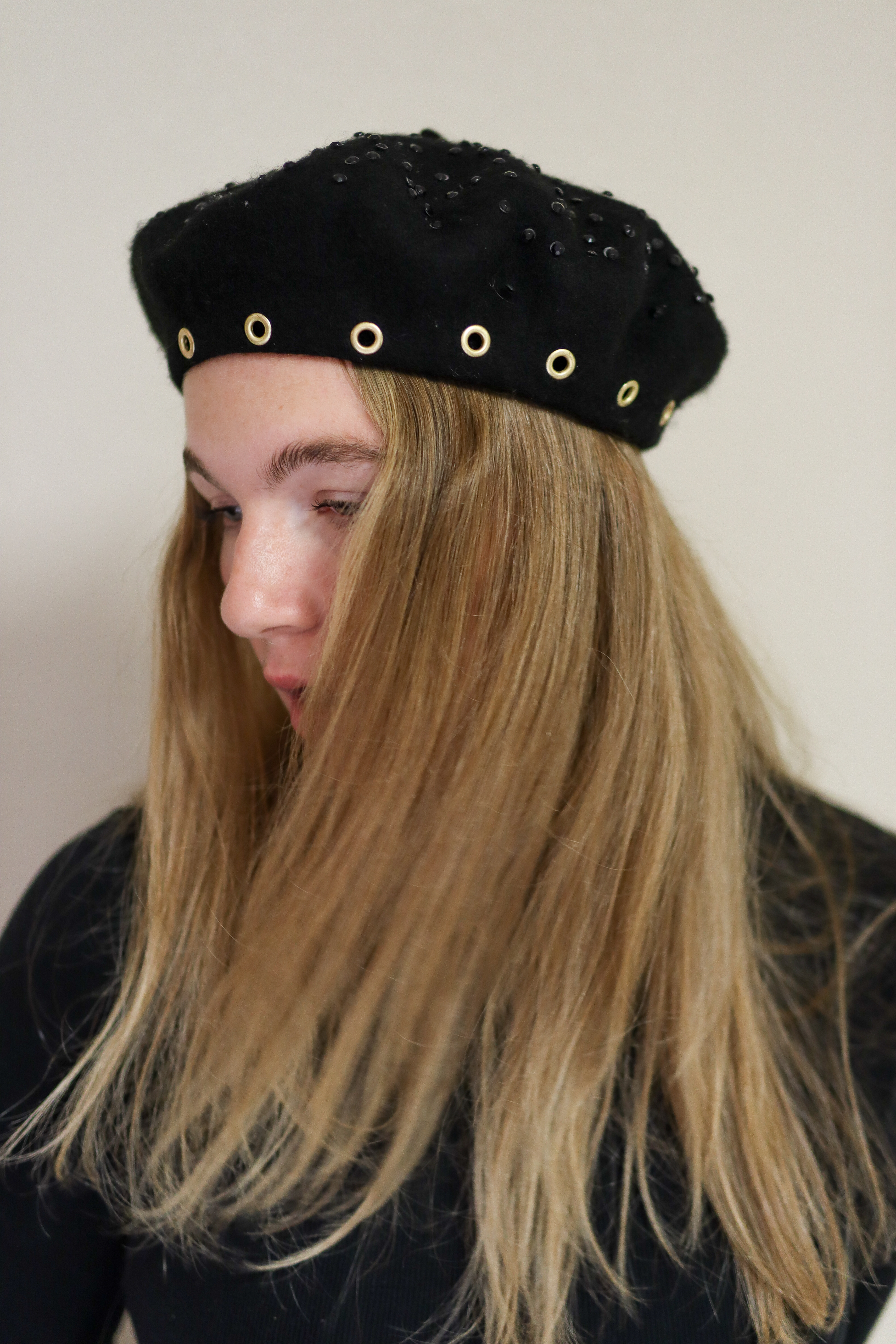
Partnered Packaging Design
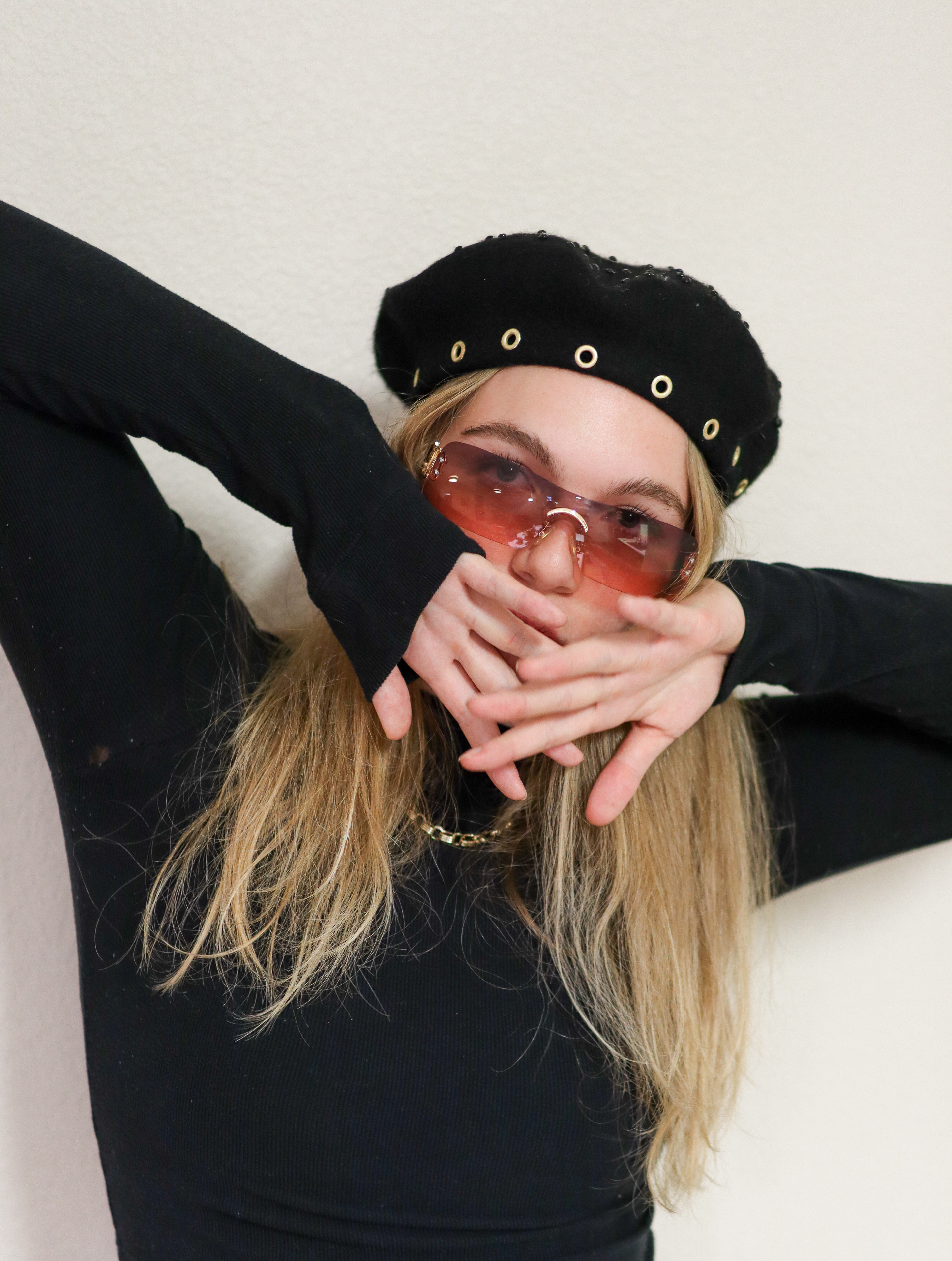
For the packaging component, I reimagined ready-to-eat and drink items, a festival bag, and merchandise. I selected Hillshire Snack Pack as a playful charcuterie option and created a bold new can design and special edition flavor for High Noon. The festival container took the form of a luxury leather saddle bag, merging functionality with elevated style. For merchandise, I handcrafted a studded beret adorned with gems and grommets, then styled and photographed the product myself to complete the presentation.